As the editor-in-chief of Veranda, Birmingham-based Steele Marcoux is an expert when it comes to color. The publication she leads has long been known as an arbiter of which way the color wheel is spinning, and what’s in and what’s out. Now, they’re finally formalizing that know-how by announcing their very first Color of the Year: Electric Amber. Warm, natural, and with a bit of a glow, it’s a hue you’ll be seeing everywhere in the design world in the months to come.
We spoke with Steele to learn more about this chic shade of the moment, as well as Veranda‘s process in selecting it. Learn more about Electric Amber below—as well as how to use it in your own designs, along with all of Steele’s favorite color combinations.
Shop Electric Amber on Chairish
Product_id 1351545 not found
Product_id 10671064 not found

Why did Veranda decide to start selecting a color of the year? And what was it about Electric Amber that drew you in?
Veranda is considered an authority on color – many of our most read articles on veranda.com focus on color and how to decorate with it. Furthermore, our best-selling covers over the past two years have prominently featured color, typically several shades of one color. We typically double down on covering “decorating with color” during September-October to align with the timing of various paint companies’ and other color authorities’ announcements of their “colors of the year.” So, when we were planning our color spotlight for this year, one editor asked, “why don’t we name our own?” We all got so excited about it there was no turning back.
To come up with our own color, we had every editor present his/her own suggestion of a color with a mood board and a five-minute pitch on why his/her color merited being our color of the year 2024. There were 13 colors pitched. We had several rounds of voting to seed a “tournament” of the final four colors. Ultimately, Electric Amber prevailed!
Now, what is Electric Amber and why did we choose it? Well, first and foremost, it invokes the sweeping return to nature we’ve been observing. The material is a resin that comes from trees, which produce the resin as a protective measure to fill in gaps in their bark. Thus, amber has long been associated with healing properties. When light passes through amber, it appears to glow—and this electrified version of it is the inspiration behind our color, which is not quite golden yellow and not quite glowing orange but somewhere in between. Especially for an election year, we are seeking healing and optimism and light—a glowing filling in the gaps if you will that radiates positive energy.

How do you see the color being used in design?
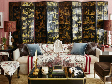
All good design starts with the light, and light is intrinsic to Electric Amber. We envision bringing in amber textiles that have a sheen (silk, velvet, mohair), so their appearance shifts with the changing light. We love the idea of decorating with amber glass that dances as light passes through. Even certain woods, especially antique pieces, with high sheen and golden hues can take on the appearance of Electric Amber—and create the same energizing glow in a room—as the material itself. And we envision spaces enlivened with artwork—from a single glass sculpture to a mixed media triptych—in Electric Amber. We even envision enveloping a room’s walls or ceiling in an Electric Amber-like finish—perhaps this comes from swathing surfaces in a luminous textile or decorative painters creating a surface with the appearance of light glowing from within.
Do you see any vintage or antique applications for Electric Amber?
Absolutely! Although we were intentionally forward-looking in our selection of our 2024 color of the year, there is a subtle air of nostalgia to Electric Amber that is integral to its appeal. As a material, amber has an old soul. According to the International Gem Society, it was the first material used to make jewelry—so you could say it has been a part of our design lexicon since the beginning. The color, especially the vibrant version we’re channeling for our color of the year, appears in historic rooms by iconic designers like Billy Baldwin, David Hicks, and Renzo Mongiardino, and is perhaps best illustrated in the historic Amber Room from Catherine Palace in Pushkin, Russia. Decorating with vintage pieces is one of the best and most original ways to invoke historic interiors today and some ideas for to incorporating an accent of Electric Amber into any space include vintage burlwood pieces, vintage Murano glassware and glass lighting, vintage velvet upholstery in related shades, and even vintage tortoise shell accessories. And of course, vintage art—especially oil landscapes and portraits—is another great way to bring in the color in small doses.

What are some of your favorite color combinations in general right now?
With the help of close friend and designer Anne Turner Carroll, I have been decorating my own house this year—den and dining room—so I am a little partial to color combinations I have been using there. My den features a mix of plum, gold shades, deep teal, gray and—thanks to my latest Chairish find, a vintage octagonal ottoman—a few accents in raspberry. I really love mixing warm and cool colors and have always loved pairing golden shades with cool grays and greens. That’s what you’ll find in my dining room. And, I must say, I have completely fallen for raspberry and plum and love Farrow & Ball Porphyry Pink (my entryway) with Brinjal (my den).
These days, it feels like there’s some much brown, gray, and greige out there… how should people incorporate more color into their spaces without it being overwhelming?
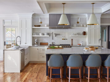
We really do love adding color into any space with art and accessories, especially vintage ones. Anyone who knows me well knows I love color and am not afraid to go big and bold with it (chartreuse stairwell, anyone?) and yet I went neutral in my own kitchen—think warm grays and creams—because I wanted my collections of pottery, vintage glassware, cookbooks, and art to really shine. The other color trick I have learned from the amazing designers featured in Veranda is to decorate with several shades of one amazing color. This is an especially successful way to embrace bold color without going overboard.
Shop Electric Amber on Chairish
Product_id 4115128 not found
Lead image: Design by Yates Design. Photo: Stephen Karlisch, as seen in Veranda.


