
As a creative, it’s fair to say that Happy Menocal is a Renaissance woman. Having started her art career by creating stationery and a family crest for a friend’s wedding years ago, she’s since branched out into murals, paintings, prints, illustrations, and even hand-painted lampshades. This open eye to creativity is a trait she shares in common with her mother, artist Katharine Barnwell, who develops, among other things, the most charming fire screens we’ve seen this side of the après-ski scene.
We recently got a peek inside the duo’s creative process at Happy’s studio. See some of our favorite shots below along with our interview with Happy, and be sure to shop the pair’s respective latest pieces, including all new prints that come in fabulous triptychs and diptychs — when you just can’t get enough of a good thing.


Happy Menocal on Her Work…
You got started with your business with a request to create wedding stationery for a friend. Tell us a bit about that and how your emblem designs came out of that.
In 2009, my first dear friend got engaged and asked me to design her wedding invitations. I hadn’t demonstrated any real artistic ability at this point, but she took a chance on me. I had this idea that I would invent a coat of arms for her new family, and by painting it in my amateur hand, it would lose the ostentation of being a “family crest.” My friend has great style and we printed everything on fine cotton paper with rounded corners. There were about 12 girls at that wedding who were either engaged or about to be, and almost overnight I found myself in the business of designing wedding stationery.
How do you go about creating emblems for different people? And does that process differ when it’s for an individual or a company?
We research each project extensively. This starts with just talking to the client for a while on the phone (or in person if it’s possible), and asking them to fill out a “journal” we create for them, which also acts as a repository for any images they want to share with us. We then conduct our own investigation into the world surrounding the project. This could mean a field trip to a botanical garden, a specialized food store, museums, libraries, eBay k-holes… We like to swim out beyond the shallow waters of the Internet. I like to feel like I have a big cornucopia of images and ideas associated with each project when I sit down at my desk to begin drawing. I like to just kind of reach into it at random and pull things out and see where they take me.
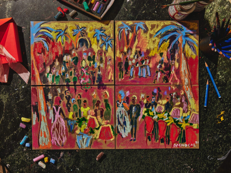
Tell us about some of the murals you’ve made for people’s homes. How did that begin, and what’s your process like?
My friend Starrett Ringbom is a decorator whose style I really admire — a lot of zippy mid-century Italian mixed with uptown classics. She gave me carte blanche to paint her foyer. She loves Fornasetti and also a primitive, happy Alexander Girard-style illustration. Her aesthetic is so clear and consistent, and we understand each other so well, there wasn’t much conversation necessary.
I decided to do some ultra-stylized topiaries, and then a little trio of faces (Starrett’s, her husband’s, and her son’s) smiling beatifically along the ceiling with the sun and the moon. The colors are relatively subdued (pale lemon yellow, sage, dove grey, navy).
Afterward she took me to La Grenouille for lunch and gave me a treasured book, Ludwig Bemelmans’ How to Travel Incognito.


Who are some of the artists and designers who most influence your personal style?
My mother, Katharine Barnwell, is a decorative painter. She taught me everything.
William Steig is my favorite children’s book author, and I think I learned from him a love of textile, of anthropomorphic animals, and a sense of humor and poignance in all things.
For color and just courageous gesture, I love Cecily Brown.
Fashionwise, Duro Olowu, Anna Sui, Acheval Pampa, Isabel Marant.
Interiors-wise, India Mahdavi, Giancarlo Valle, Fernando Santangelo.
What are some of the products you make with your designs, and what are some of the pieces you’d like to make?
Our focus as a studio is almost exclusively custom work for private individuals and small brands. We design logos, package design, stationery, textiles, and occasionally murals. We are also working on some very exciting linen, upholstery fabric, and wallpaper projects at the moment.
Honestly my favorite thing is giving presents. One year for Christmas we sent out 100 giant Everlasting Gobstoppers, wrapped in custom boxes with big raw silk ribbons. In terms of products, I’d like to make a collection of dinner plates and a design for currency or stamps.
Tell us about your personal spaces and how you design at home. How would you describe your aesthetic? How does vintage fit into that?
We recently moved from Brooklyn to an early 18th-century farmhouse in Northern Westchester. I’m letting the house itself do most of the talking. The majority of everything I buy and own is vintage, both for clothing and home. I didn’t consciously start from a position of sustainability; it was more of a quality, originality and price thing.
There are brilliant people making new things in the home space all the time (I love the guys behind Goodee, for example), but pound for pound, older things that have lasted this long are better made than the stuff that’s getting churned out today at a dizzying pace.
I’m messy and hard on my things, so I shy away from fragile, precious objects and materials. I like practical, workhorse things. I love wood, stone, wool, plaster — elemental, earthy materials. I love silver — the way it looks when it’s just been polished. I love whiteness and airiness and happy, off-hue colors sprinkled here and there. I’m so disorderly that I try to keep the main scheme pretty simple and straight, so the chaos kind of grafts onto it like vines on a lattice. And our kids add their own funny patina.
I am drawn to twee little trinkets, but I really hate them. It’s a constant tension, and probably plays out in my work and personal life. I’m like a monk who keeps breaking his vows, filling my simple wooden bowl with plastic action figures and M&M’s.
What do you find most compelling about Chairish? And are there any dream vintage/antique “gets” you wish you could have? What’s a dream piece for you?
Chairish has somehow threaded the impossible needle of being at once a boundless smorgasbord while still feeling luxurious and edited. And not to brag, but I think I was an early adopter. I bought my most beautiful sheaf of wheat table that’s now in my studio from Chairish in 2015, and my favorite Moroccan rug in 2016.
In terms of dream pieces, a couple Lalanne sheep or Majolica begonia plates. I also really like insane Filikli Turkish rugs; they’re like furry monsters. I like them in combination with all of our Shaker furniture.


Happy’s Design Favorites…
Favorite way to create a statement-making moment in a room:
Dragging in a big branch from outside
Favorite decorating “cheap thrill:”
Butcher paper. Wrap your table, cover your walls, wrap your TV, wrap your kids.
Favorite iconic piece of vintage design:
A great American quilt
Favorite paint color:
I love the color of raw canvas; I don’t know a paint color that achieves that. Someone please tell me!
Favorite piece of decor in your home:
Our old fruitwood oval table. It has little inscriptions in it from insects that look like Aramaic.
Favorite designer or artist from the past you most often turn to for inspiration:
My favorite room of all time is Monet’s yellow dining room at Giverny.
Favorite style icon:
Gloria Vanderbilt
The design destination every creative should visit at least once:
The Strand in New York or Powells in Portland, Oregon
The best piece of career advice you’ve ever received:
My friend Lauren Collins did a profile of India Mahdavi for The New Yorker, in which Mahdavi reveals herself to be absolutely fanatical about color, but devil-may-care about hanging pictures on the wall. You may end up with a couple misplaced holes in the wall; just grab a bit of spackle and some gouache or whatever you have. I’m the same way, so this spoke to me, but I also just generally appreciate the concept of distributing your fanaticism as you see fit.


Happy’s Lifestyle Favorites:
Favorite vacation destination:
Paris
Favorite hotel that’s inspired your work while traveling:
I’m looking forward to staying at Hotel Kinsley, in Kingston, NY. I did their logo and a mural in their dining room.
Favorite restaurant:
Not a novel answer but: Balthazar
Favorite small museum:
The Musee DeLaCroix in Paris and the Peabody Essex in Salem, MA
Favorite podcast:
I love Guy Raz’s How I Built This.
Favorite Instagram accounts to follow:
@press_sf for great and often obscure design books. @fernando_santangelo for handsome architectural details. @duroolowu for his sublime clothing designs and art history & culture. @joanneyun for fine botanical illustration and some cooking. @genemeyer3 for a heavenly life in Tangier.
Favorite hostess (or thank you) gift:
Just put yourself in the hands of Rebecca Gardner @housesandparties.
Favorite flower:
Daffodil
Favorite adult beverage:
Paloma
Favorite way to unwind at home:
Standing at the kitchen counter scrolling through my phone while eating clementines
Favorite entertaining essential:


All images: Alex Lau


