When designers describe themselves as “color experts,” we often think they’re referring to bright, bold hues — magentas, emeralds, cyans, and other trending, electric colors that together craft a decadent, maximalist space. However, color experts also know how to evaluate minuscule differences in shade and tone easily missed by an untrained eye, and they bring this color finesse to neutral-hued spaces as often as those that are brilliantly colored. Here, top designers skilled in subtlety reveal how to achieve an elegant neutral space rich in multi-dimensional color.

MATERIAL MATTERS
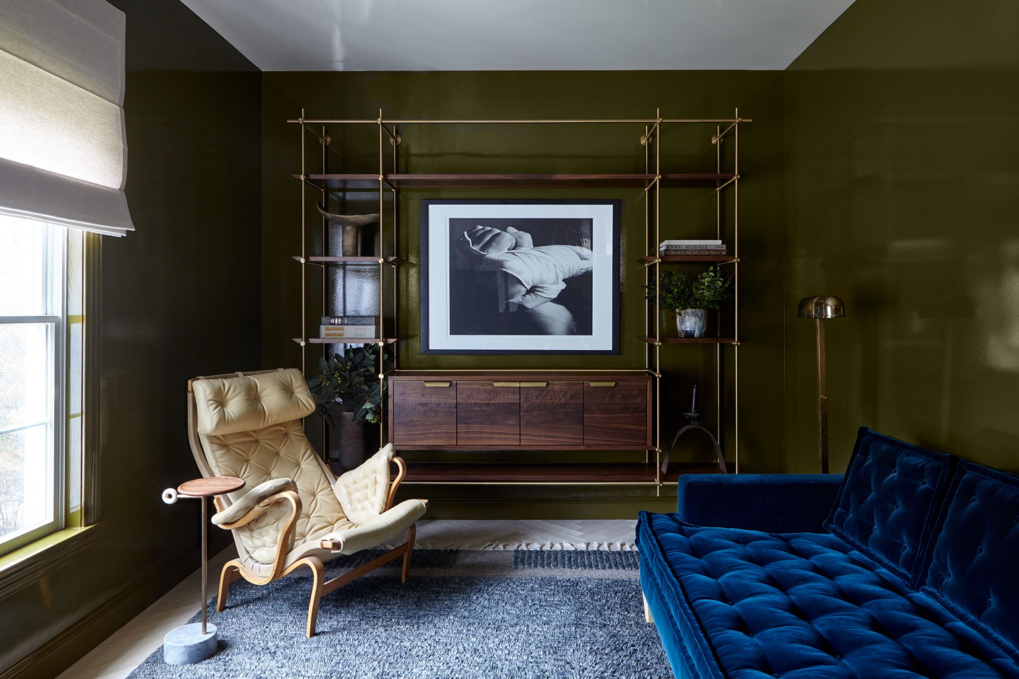
Stephens Design Group
Favorite Neutral Shade: Taupes and grays with pink undertones
A kitchen in a neutral palette is a soothing environment to spend time in, and neutrals make the food and people in the space look gorgeous. Warm wood tones, rich metal finishes, and surface materials with depth are inherently welcoming — ideal for the heart of the home.
I often use resilient quartzite slabs for countertops and backsplashes, many having crystalline waves of beige, taupe, gray, and green hues swirling through them. Bleached walnut and cerused oak are two of my go-to cabinetry finishes, paired with off-white walls and earthy stone floors. For warmth and interest on the walls, I like to use troweled plaster finishes in varying degrees of sheen and texture depending on the style. I have no fear of mixing metals, and use combinations of stainless steel with bronze or brass tones to provide contrast and pops in a neutral palette. I introduce luxurious natural materials to make the palette more dynamic — for example, I’ll use accents in shagreen, parchment, or straw marquetry, or larger pieces like distressed leather banquettes or a smoky bronze mirror.
— Bradley Stephens, Stephens Design Group
Above, the bright, neutral kitchen is located in Bridgehampton.
Favorite Neutral Shade: Taupes and grays with pink undertones
MIXED FINISHES
Greyscale Interiors
Favorite shade of neutral: White Dove & Vanilla Milkshake by Benjamin Moore
I often like to treat colors as neutrals by selecting a color that has a complexity to it or a rich pigmentation/saturation. In this case [pictured above], a custom olive green in high gloss is very striking, yet timeless and sophisticated. That said, White Dove and Vanilla Milkshake by Benjamin Moore are my go-to neutral neutrals – not too gray, not too cream, not too stark, just right – which we used on the ceiling in this en-suite study.
It is crucial to observe the light (natural and added) at multiple times throughout the day/evening. All colors, and neutrals in particular, can look completely different in different areas of the room at different times of the day, and depending on what lighting you have turned on when. Additionally, consider furniture and materials that will be in the room, as metals can bounce light, furniture can create shadows on the walls, and fabrics can absorb light.
One of the most successful ways to pair neutrals is to use several shades within the same hue and then mix the paint finishes (satin, gloss, flat…) to create visual interest. High-gloss walls or a high-gloss ceiling will create depth and a dynamic reflectiveness, allowing light to bounce around. If you’re not looking to make as much of a statement, an eggshell or flat finish looks clean on walls with satin (or gloss) finish on trim, window casings, and door surrounds to give a sophisticated highlight to architectural details.
— Lexi Tallisman, Greyscale Interiors
Here, Tallisman mixed materials for an en-suite study design in Westchester, New York.
Favorite shade of neutral: White Dove & Vanilla Milkshake by Benjamin Moore

TONE-ON-TONE LAYERING
Amy Kartheiser Design
Favorite neutral: Layered creams and whites
When it comes my designs, the fabrics and textures are just as important as the color palette. Because I like to keep the color palette soft in neutral spaces, I love adding plenty of texture by including a variety of fabrics that add depth to the overall design. Boucle, wool, sheepskin, linen – you name it, I love it! For neutral bedrooms, I like to keep the color palette soft, even with accent colors. When designing bedrooms, I always aim to create a calm and relaxing environment, so I love incorporating lighter colors because I personally think they are the most serene and soothing. Some of my favorite accent colors are gold, blues, and pinks.
I am also a tone-on-tone person. I love layering creams and whites on top of one another with different textures and materials. This adds so much depth and interest to a design.
— Amy Kartheiser, Amy Kartheiser Design
For a bedroom in Winnetka, Illinois, Kartheiser built a textured master bedroom with metallic accents.
Favorite neutral: Layered creams and whites

REJUVENATION, RESTORATION & RELAXATION
House of Funk
Favorite shade of neutral: Creamy, warm gray or cool beige
Neutral palettes are perfect when we are going for rejuvenation, restoration, and relaxation. They act as a wonderful backdrop for beautiful furnishings, art, and accessories, allowing statement pieces to shine. Neutral palettes are all we need when we have truly stunning architecture, as that requires very little extra help. In this case, the neutral color palette supports the choice to have one focal point pop of color. While we love an entirely neutral palette as well, this one plays the role of supporting cast members to our area rug star.
I love a creamy, light, warm gray or cool beige as a neutral. You say potato, I say potato, right? The room’s exposure – the direction and amount of windows/light – and how you intend to use the space, as well as how you want to feel in the space, play a huge role in the color that will be right for a specific space. Benjamin Moore’s China White is one of our go-to neutrals for its subtle, sophisticated tone and warmth. Farrow and Ball’s School House White is always stunning too.
— Sandra Funk, House of Funk
In this design in Montclair, New Jersey, Funk used layers of neutrals and pops of color to make a statement.
Favorite shade of neutral: Creamy, warm gray or cool beige
Get the Look


Product_id 1639240 not found


