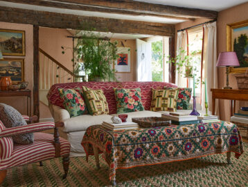
Brazen blue. Fearless fuchsia. Nervy navy. There’s no way around it; decorating with bold color requires backbone. While few things transform a room quite like exuberant color, high-voltage hues do present a margin of potential error. A rich-with-color room isn’t pull off; however. In fact, by sticking to a few simple colors formulas, it can be remarkably easy to pull off a radiant room. Here, we spotlight four vibrant rooms cued up by the pros and decode the easy-to-copy frameworks you can use when washing your own home in extroverted hues.
Shop the Look
Product_id 3791792 not found

Go Monochrome
If you’ve ever marveled at the more emboldened paint shades at your paint store and pondered, is it possible to actually pull them off? The answer is yes! The caveat? Go monochrome. Any shade can be drafted for a one-tone takeover, though you’ll often see designers employing it for warmer, joyous shades like peach, corals, and yellows. Often, designers will use two or three shades of a predominant color and then accent with a more neutral shade. In the case of oranges and yellows, taupes are a good bet.

Repeat a Pop of Color
If you’re partial to an outgoing color like pink or yellow, but you aren’t keen on using it in surplus, consider administering small doses around your room. To start, choose a more neutral base color to anchor your room. Designers will often recommend a hue that sits opposite the more boisterous shade on the colorwheel. Officially called “complementary colors,” these color combos can include green and red or pink and blue. Construct a base with varying shades of your complementary color, then add pulses of your more lively hue. Soft textiles like drapes, pillows, bedding, and rugs are all excellent options for displaying the more dominant shade.

Design by Michele Platcher / Photo by Andrea Cipriani Mecchi
Pair Color with Black and White
If safety rails appeal to you, consider selecting a single vibrant shade and partnering it with a bounty of black and white. Black and white don’t just complement every shade — both dramatically enhance it. This means whether you’re partial to peach or yearning for a yellow moment, this trick works like a charm. Gray — a mix of gray and white — can also be worked into the mix without throwing anything off-kilter. Mable, a constituent of gray, is a also a shoo-in, should you be looking for a material that can be used on tabletops, flooring and more.

Make it a Medley
Designer Summer Thornton, an avid lover of color, encourages DIY designers to loosen the strings when it comes palette. Rather than restricting a room to one or two shades, she says, “I love when ten or more colors all seamlessly blended together. Sure, there may be a lead or dominate color in some of my of my designs, but most have over twenty colors. I don’t believe in ‘schemes’ or ‘combos’ because I think they’re too isolated. I believe that when you blend twenty colors and patterns together, you create a symphony-like feeling as opposed to a singular-instrument feeling that you might get from a more limited palette. One feels so much richer, diverse, and well-rounded, whereas a more limited color combo feels flat in comparison.” Which is all to say — if letting loose with color appeals to you, embrace it!
Lead image design by Michele Platcher / Photo by Andrea Cipriani Mecchi


