We asked top designers to share with us the colors that they were most looking forward to using in their upcoming design work. While the answers ranged from deep blues to bright yellows, one trend is clear—2017 is all about rich, saturated color. Here, see what shades these 6 experts plan on using in the year ahead.

1. Green-Black
“The color of the year is green, and I’m especially drawn to Pratt & Lambert’s Blackwatch Green (19-17), which is dark and intense without being black. It looks fantastic as a high contrast with light walls. I used it in a high gloss finish for this room in the Napa Valley Showhouse, and it had a dramatic, seductive feel.”
Elena Calabrese, of Elena Calabrese Design & Decor


2. Mustard Yellow
“We are putting together several schemes this year with mustard and turquoise colors. In this Atlanta home, we used Benjamin Moore’s Eye of the Tiger (188) for the sunroom/bar area. We wanted a saturated color on the walls that still felt natural, and this yellow-orange shade was perfect.”
Carter Kay, of Carter Kay Interiors
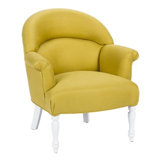
Get the Look


Product_id 1354247 not found


3. Cerulean Blue
“I never tire of Cerulean blue. It is timeless and pairs beautifully with so many other colors. I especially like using it on unexpected surfaces, like the kitchen cabinets above, which are done in Benjamin Moore’s Marine Blue (2059-10). When used in a high gloss lacquer, the intensity of the color is really highlighted.”
Rachel Reider, of Rachel Reider Interiors


4. Yellow-Green
“One of my favorite colors that is trending for 2017 is a deep yellow-green. When green has yellow mixed with it, the color adds a note of warmth to a room and brings the outside in. The overall look is a sense of tranquility yet still lively. Paints that achieve this shade best are Benjamin Moore’s Guacamole (2144-10) and Sherwin Williams’ Saguaro (6419).”
Jo Ann Alston, of J. Stephens Interiors


5. Deep Blue
“In 2017, people are embracing color, and a deep blue is an easy choice because it’s practically a neutral. In this playroom, I used Sherwin Williams’ Moscow Midnight (SW 9142) for the back of the bookcase. My client and I both loved rich blue-greens, and the deep saturation of this vibrant hue grounds the bright tones in the room and adds a graphic backdrop to the accessories and toys.”
Caroline Kopp, of Caroline Kopp Interior Design


6. Saffron Yellow
“The popularity of dark blue and gray walls of the past few years has opened the door to a wide array of saturated colors for 2017. Saffron is a color that brings enormous warmth and richness to a room and evokes a sense of exoticism and mystery. We used a custom color mix in this penthouse and paired the saffron shade with turquoise and Chinese red for the perfect counterpoints.”
Elizabeth Vallino, of Elizabeth Vallino Interiors