
When saddled with the task of picking a paint to complement dark bedroom furniture, most of us instinctively veer toward the lighter side of the color spectrum. While the gut reaction feels natural, should we be rejecting shrouded shades in these scenarios? Or is it true that dark furniture requires something more robust and bright? The elephant in the room, of course, is traditional brown furniture—a subcategory that introduces a whole other host of other questions to the equation. To settle the speculation, we’ve gone straight to the pros and asked them to share their tips for hitting the mark in the dark. Here, 10 designers share their best advice for choosing paints that flatter dark bedroom furniture and share the just-right hues they picked for their own favorite projects.
Shop the Look

Product_id 3038576 not found


It sounds like a riddle: What makes a small bedroom with dark furniture feel bigger? Dark paint! If a saturated shade wasn’t your first guess, La Jolla, California-based designer Andrea May encourages you to reconsider. “I love a deep, cool color for a small bedroom,” says Andrea, who selected the dark blue Benjamin Moore shade Gentleman’s Gray for a home with a luxurious California bungalow feel. “The walls recede, the corners and shadows disappear and the lighter items in the space advance.” While a brawny Art Deco bedroom set may have caused a less confident designer to retreat to the comfort of neutrals, Andrea took the opportunity to create a burrow-like retreat, courtesy of a dark bedroom color.

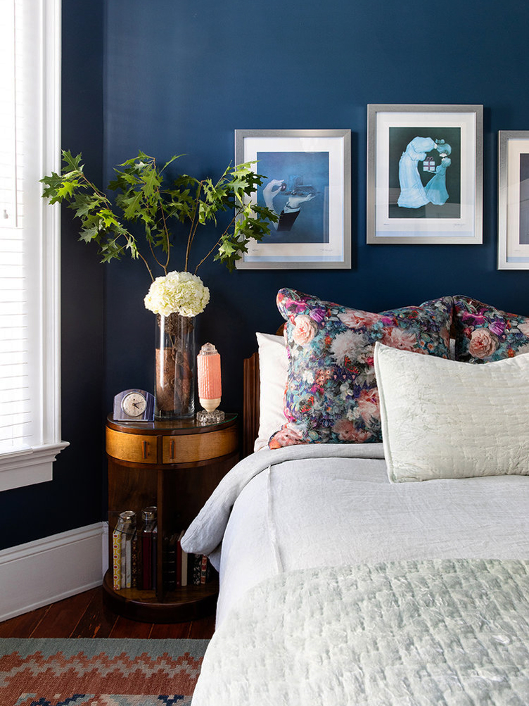
Another designer who’s on the small space + dark furniture + dark paint = perfection equation bandwagon? Chauncey Boothby of Chauncey Boothby Interiors in Rowayton, Connecticut. “Don’t shy away from painting a small space a dark color,” she reinforces. “Sometimes the smallest spaces create the coziest jewel box-like atmosphere.” For a vibrant family home, Chauncey elected to cloak one of the home’s bedrooms in a rich, sapphire blue color to offset a black wrought iron canopy bed. To prevent the bed frame from disappearing into the walls—a definite possibility given the two pieces’ similarity in color— Chauncey make shifted a fabric canopy out of a bolt of lighter colored fabric, effectively creating a visual buffer.
Most designers are all-in when it comes to taking color cues from nature. So with brown furniture, green naturally springs to mind. If you are inclined to engage with an arbor-inspired palette, avoid a literal interpretation and take cues from this enveloping escape teed up by the Chicago-based firm Studio 6F. Rather than opt for a shocking shamrock shade, designer Gil Melott sprung for a gray-hued iteration of green: Benjamin Moore’s Knoxville Gray. A shape-shifting color that will transform with the daily ebbs and flows of light, the color has both a cooling and warming effect—ideal if you’re looking for a dark bedroom color. When paired with the room’s dark wood furniture it feels both fresh and den-like. According to Gil, the color is custom-made for “sleeping in late.”
Shop the Look
Product_id 1358770 not found
Product_id 277868 not found


For a bedroom that hit particularly close to home—her toddler daughter’s—Atlanta-based designer Jessica Davis of Atelier Davis selected Benjamin Moore’s Dartsmouth Green. “I chose the color because I wanted the room to feel a tad moody,” she explains. “It was already quite bright, so I knew I could use a dark color, and this shade of green possessed the perfect level of saturation. It’s a blue / gray / green that really changes with the light. Not too dark that the dark furniture just blends right in; but not so light as to appear overly contrasty either.” As a bonus, the gender-neutral shade will have no problem maturing alongside her daughter.

Dark furniture can be especially perplexing if you’ve been handed down traditional brown furniture that doesn’t harmonize with your existing pieces. For situations like these, Chicago designer Jodi Morton of 2to5 Design recommends harnessing the power of a neutral like gray, which tends to complement dark furniture and light furniture with equal aplomb. For a large bedroom filled with a collected mix of furniture, Jodi rolled out Benjamin Moore’s Rock Gray, a bold gray with a hint of purple. “This bedroom is a large space and needed a deep wall color to create some intimacy in the room,” explains Jodi. “Rock Gray is the perfect backdrop for the eclectic mix of furniture and looks great paired with the white trim.”


One foolproof way to ensure a paint color goes with dark wood furniture without a hitch is to look for shade with an undercurrent of brown. For designer Paul Corrie, Benjamin Moore’s Dragon’s Breath—”gray with a hint of brown”—was just such a color. “A dark paint color can add an overall sense of drama, depth, and mystery to a bedroom,” says Paul. “It also has the ability to create a cocoon-like effect, and subtly invoke a sense of calm.”

Dark bedroom furniture and light walls aren’t taboo, of course. The two can partner quite effectively, as shown in this striking bedroom created by Thomas Jayne of Jayne Design Studio Inc. “Here, a soft blue highlights the mahogany of an 18th-century French secretary and a Mid-Century table with equal aplomb,” says Thomas. “Many of our clients love blue for their bedrooms—they find it both fresh and tranquil, especially as it references the sky and sea. Of course, blue and brown are complementary colors, and brown can be considered a neutral, as well.” To avoid a jarring contrast, consider doing as Thomas did and pepper in a few wood pieces that are lighter in tone among your darker ones. You’ll notice here that the brown bureau and desk are accompanied by a white-painted Louis chair and Neoclassical valet, tempering the overall look.

White has a knack for making virtually every color it butts up against look crisp, but with dark colors like brown, it can sometimes skew a bit stark. One solution is to employ a white with a cream-ish cast. Los Angeles-based designer Tammy Randall Wood of Interior Archaeology recommends Benjamin Moore’s Grand Teton White for anyone on the prowl for that perfect shade of gently-aged white. “It’s a color I’ve used often when I want the walls to read white, but need to connect them to woods that are on the darker side,” she explains. “It has enough pigment to create gravity and not feel like a thin primer.”
Shop the Look


Product_id 2485044 not found

Dark woods like mahogany or walnut may be simpatico with darker wall colors, but oak, which possesses more golden highlights, isn’t always a seamless fit. For a bedroom outfitted with an oak bedroom set, Denver designer Nadia Watts chose Benjamin Moore’s Navajo White to dress the walls. For Nadia, the ecru-like hue is one worthy of putting on repeat, easy to break out anytime you need an in-between shade of white that won’t alienate middle-of-the-road-colored wood.

Another way to achieve an alluring aura in a room with oak furniture is thinking pink, as designer Jackie Armour of JMA Interior Design did in this elegantly layered bohemian bedroom. To enrich an ornately carved bed with a cerused oak finish, Jackie selected a rich dusty pink hue with a subtle metallic-feeling glow, similar to velvet. The sheen enhances the bed frame’s silvery notes, making it feel visually lighter than it might otherwise—a trick worth employing if you have multiple oak pieces in a bedroom. Jackie also elected to crown the ceiling in the same shade of pink (but left the wall perpendicular to the bed bare), further enhancing the lair-like feel that dark furniture seems to invite.
Shop the Look


Product_id 2695551 not found
Lead image by Read McKendree / Design by Chauncey Boothby Interiors


