With Pantone’s Greenery named the color of the year for 2017, we anticipate seeing more and more green and nature-inspired accents in home design. To get a jump on this trend, we asked 8 top designers to share with us their favorite green paint colors and show us the spaces where they’ve used this refreshing shade. From shamrock greens to deep olives, see the favorite colors below.

Benjamin Moore’s Bunker Hill Green (#566)


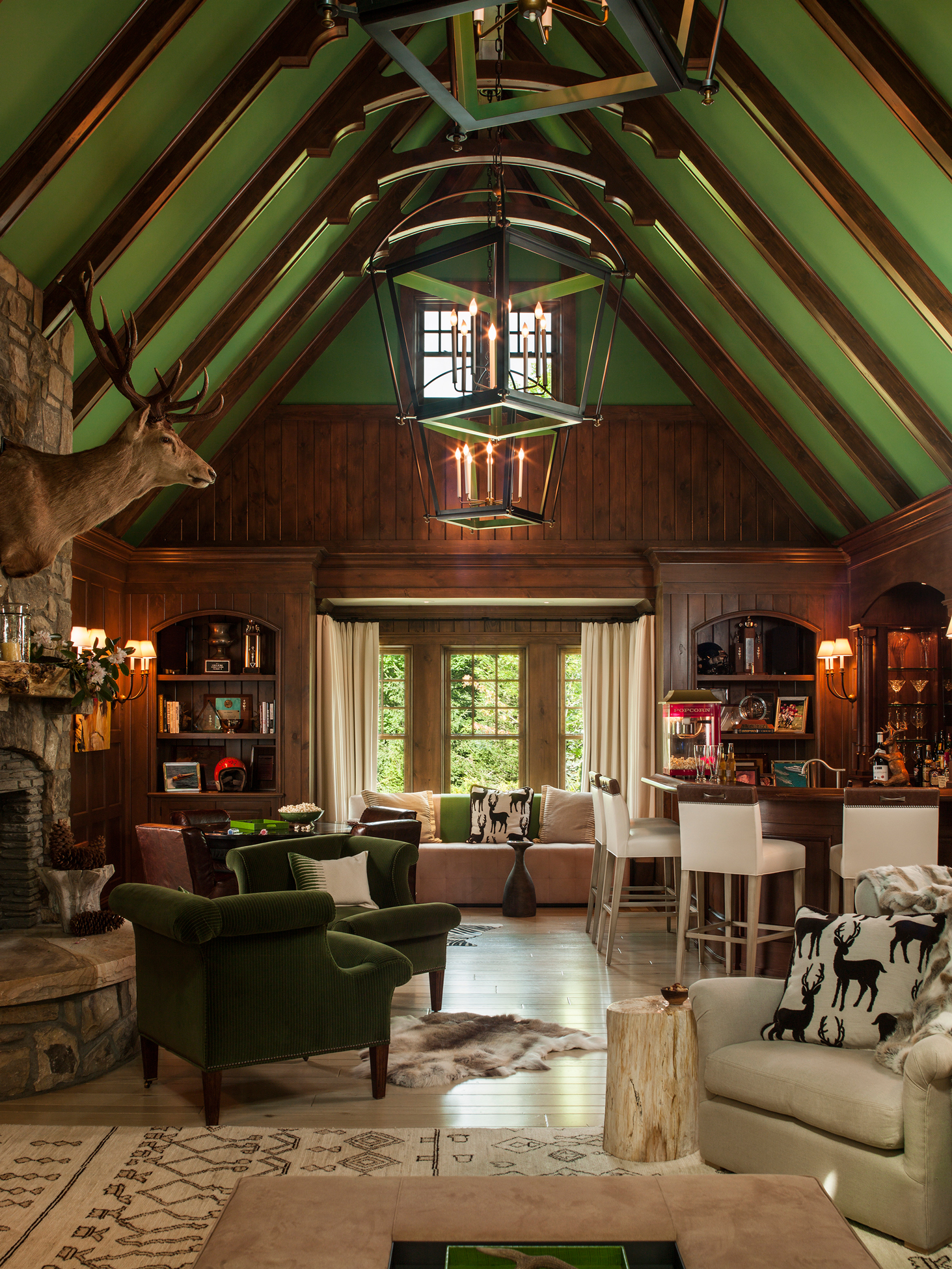
Benjamin Moore’s Mountain Lane (#488)


Sherwin Williams’ Palm Leaf (#7735)
“The biggest design challenge with this kitchen was that it is in the center of the house and has no windows. Instead of fighting the lack of light by painting the cabinets a bright color, we went dark and moody. This green achieves a dramatic vibe, but also brings in an element of nature—and looks great in candlelight.”
Stacey Copeland, of Blythe Home


Farrow & Ball’s Breakfast Room Green (No. 81)
“This colorful home in Austin has an easy flow from room to room. In the dining room, which is right off the entry and visible from the front door, we wanted to instantly grab the eye and be a bit more bold but still coordinate with the other strong elements of the room. We chose Farrow & Ball’s Breakfast Room Green for the space because it has just the right amount of blue in it to make the transition seamless.”
Meredith Ellis, of Meredith Ellis Design
Get the Look


Product_id 1756161 not found


Benjamin Moore’s Tequila Lime (#2028-30)
“We used this bright green for the built-in in my client’s office. Most of her house is neutral but she wanted a pop of something for a little fun! This space has the most color of any room in her home.”
Lisa Gutow Berman, Lisa Gutow Design


Valspar’s La Fonda Olive (#6006-6B)
“We wanted to use natural materials in this lakefront home, but because they tend to blend away, we added excitement with a bold color that drew from the exterior setting. The green color we chose for this home relieves us from all the grey and barn wood and adds dimension and brightness, while still maintaining a connection with the natural surroundings.”
Kristina Crestin, of Kristina Crestin Design
Get the Look
Product_id 1622767 not found


Benjamin Moore’s Rosemary Sprig (#2144-30)
“With all the white wood work in this Seattle kitchen, we wanted a bold wall color to give the room life. We opted for this warm, vibrant, happy green that alludes to the brighter months even on the darkest of winter days. Just like a plant, this natural shade works with everything.”
LeeAnn Baker Steding, of LeeAnn Baker Interiors Ltd.
Get the Look

Product_id 1639222 not found


Benjamin Moore’s Dark Celery (#2146-10)
“The owners of this Colonial home in central New Jersey wanted a guest bedroom that felt like a boutique hotel and embraced their love of the outdoors and bold color. This green creates a rich setting for the crisp white bedding and black and nature-inspired accents and creates a comfortable bedroom that welcomes guests.”
Iris Houlihan, of Ella Design Group


