
Designer showhouses are notorious for pulling out all the stops, and taking major design risks— hello tented bedroom! So with the debut of our first ever Chairish Designer Showhouse Sale, we knew we had to ask our participating designers to share their best tips and tricks from their showhouse masterpieces. From how they tackled tricky challenges (including wood paneling overload and a kitchen that used to be a bedroom), to the innovative new products they tried out (so you don’t have to be the guinea pig!), we’re declassifying designers’ trade secrets for every room of the house.
SHOP CHAIRISH’S DESIGNER SHOWHOUSE SALE >>

The Living Room: Amy Berry
Designed For: Dallas Traditional Home Showhouse
What are some design tips or tricks people can steal from this space?
Don’t be afraid of pattern! And don’t skimp on curtains. Whether you bring in pattern on the curtains or in the upholstery, getting in all those good colors can really pull a room together!
Name this space’s big challenge (and how you tackled it).
That firebox! Softening a gas box isn’t easy. We played with a couple options before we landed on the treillage look we used. I wanted the room to have a feminine touch to it, and the treillage gave that wall something interesting that wasn’t your typical stone surround.
What’s your favorite design risk that you took in this space?
I wanted the space to feel traditional despite it being set in a more contemporary house. The goal, really, was to take something timeless and make it feel a little newer. I personally can’t get enough of big florals and chintzes, and so I instantly knew the fabric I wanted to use. That Scalamandre print is everything…we actually used it in the blue colorway for my daughter’s room too!


The Dining Room: Chloe Warner
Designed For: San Francisco’s Decorator Showcase
What are some design tips or tricks people can steal from this space?
Don’t let the name of a room stop you from using it in a way that may be more fun or more appropriate to your family. People with kids need room for legos, art, homework, and there is nothing wrong with elevating these activities into lovely, multi-generational spaces. Call it a “lobby” instead of a “rec room” and you are already halfway there.
Name this space’s big challenge (and how you tackled it).
The sheer quantity of brown. The wood paneling was in good shape but it felt like you were swimming in a UPS truck, and we wanted it to feel modern and youthful without spending a fortune on restraining it. The massive paper lantern installation went a long way towards drawing the attention inward, and it was such a perfect balance for the walls I was actually able to enjoy the dark walls after the lights went in.
What’s your favorite design risk that you took in this space?
We completely threw out the book on what a formal dining room should be. We put in a breakfast table for intimate dining, we put in consoles for cultivating plants, and we put in a huge dining table for spreading out science projects. Of course if it were my house I would absolutely host dinner parties there too, but we designed the room to have a full life from 7AM – midnight. A real workhorse 🙂


The Hallway Nook: Krista Hoffman
Designed For: San Francisco Decorator’s Showcase
What are some design tips or tricks people can steal from this space?
I think people have a difficult time styling shelves—and generally accessorizing their homes— which was a big part of this Curio Closet. My advice is to break it down. I started by creating a few individual groupings on each shelf, since approaching shelves this way makes them much easier to tackle. Secondly, don’t be afraid to edit. Some of my favorite objects didn’t make the final cut. I edited objects within a grouping, then on each shelf, and finally within the whole room. It’s a rigorous process!
Name this space’s big challenge (and how you tackled it).
The original room was an 11′ tall, very narrow closet located off of the formal second floor landing. To make the most of the vertical space, I designed framed floating shelves made of inset glass, which allowed guests to see through the shelves and around the objects. Even though the context of the space didn’t allow guests to view the objects head-on, the objects’ materials, texture, color, and dimension were still visible.
What’s your favorite design risk that you took in this space?
I had a hard time finding the perfect hardware for the built-ins, so I designed my own. The pulls I created are made from un-laquered, perforated brass that’s been gently curved into an open handle shape. The pulls balanced nicely with the decorative objects and looked terrific on the slab door fronts. I knew I had made something really beautiful, but was surprised when the hardware was such a highlight of the room. I’m now producing the hardware in six finishes—all of which are available through my website.
Get Krista Hoffman's Showhouse Look


The Kitchen: Lisa Mende
Designed For: Southern Style Now
What are some design tips or tricks people can steal from this space?
Banks and banks of cabinets in the same color can be so boring, so in this kitchen I used Benjamin Moore Dragon’s Breath and Bird’s Egg blue to add interest. Also, add an unexpected piece. For example, the Carver’s Guild Dolphin Mirror and the Jessica O’Neill abstract painting made the room feel so much more special.
Name this space’s big challenge (and how you tackled it).
This room was originally a bedroom, not a kitchen, so we basically had to create one. The biggest obstacle was that one wall had tall windows so it was hard to place a run of cabinets for work zones. I made the decision to close up the off-center window on the north wall so I could use the space for the sink, dishwasher, and refrigerator.
What’s your favorite design risk that you took in this space?
I chose to use a new product from Crossville Tile called Laminam in the Calcutta Oro Venato pattern on the walls, from countertop to ceiling. Laminam is thin set porcelain and comes in slabs, so you don’t have grout to contend with like you do with tiles. I book-matched the pattern over the sink for added drama and it was perfect for the room.


The Bathroom: Bear Hill Interiors
Designed For: Southern Style Now
What are some design tips or tricks people can steal from this space?
Simple materials can be used to make a big statement! Instead of using white subway tile, I opted for black subways used in a crosshatch pattern to make a bold statement that’s still timeless. Keeping the selections classic gives you the opportunity to have fun and go bold with accessories and art.
Name this space’s big challenge (and how you tackled it).
Since the home was a historic renovation, the biggest challenge was paying particular attention to the historic preservation while creating a thoughtfully modern space.
What’s your favorite design risk that you took in this space?
After selecting black for the tile, it only seemed appropriate to select black for all of the paint details in the room. The benefit was that the black paint and tile blurred lines to make the space seem much larger than it actually is.
Get Bear Hill Interior's Showhouse Look


The Bedroom: MA Allen
Designed For: Southern Style Now
What are some design tips or tricks people can steal from this space?
Don’t be afraid of color and pattern. For instance, trim doesn’t always have to be painted white. Choose a color that plays a small supporting role in your scheme. Also, having small or no windows doesn’t mean you have to only use light colors. I wrapped this small space top to bottom in detail and suddenly everyone forgot that the space was lacking natural light.
Name this space’s big challenge (and how you tackled it).
The biggest challenge in designing this space was the low ceiling height (87″). Wrapping the walls and ceiling in a blue-and-magenta striped fabric made the space feel dramatically expanded.
What’s your favorite design risk that you took in this space?
Tenting a room with such low ceiling height was a risk. But by creating an axis on the ceiling and centering the stripes around it, it truly made the ceiling feel higher than it was.


The Boudoir: Rajni Alex Design
Designed For: Hampton Designer Showhouse
What are some design tips or tricks people can steal from this space?
Papering an accent wall with decorative wallpaper and painting the rest of the walls will keep costs down while still creating a layer of interest. In this space we just did the opposite, with one wall receiving decorative paint and the rest grasscloth wallpaper. Also, in small rooms, dark colors can actually make a space feel bigger when aligned with the correct floor plan. Lastly, adding a high-gloss finish on trims is an easy way to elevate the look of a space.
Name this space’s big challenge (and how you tackled it).
The biggest challenge in this space was the uncentered ceiling. Symmetry is very important in design and so we added crown molding with cove lighting which gave the appearance of the ceiling being centered over the floor plan.
What’s your favorite design risk that you took in this space?
The architectural detail of the crown molding not only solved a challenge, but also added an element of risk. Knowing that the cove lighting would bring eyes upward, it was necessary for the crown molding to blend seamlessly with the room.


The Kid’s Room: Bella Mancini
Designed For: Brooklyn Heights Showhouse
What are some design tips or tricks people can steal from this space?
Using wallpaper on the ceilings is an easy way to add a major wow factor. I’ve always been mad about the wallpaper we used, but putting it on all four walls felt like a bit of a gamble. I want all the kid’s rooms we design to be fun as all get out, but you also want them to be able to sleep at night!
Name this space’s big challenge (and how you tackled it).
The walls were totally uneven and without having the budget to skim coat them, we covered them in a grasscloth that helped conceal the bumps. Like Spanx for walls!
What’s your favorite design risk that you took in this space?
Well, obviously the ceiling was a bit crazy, but the biggest risk the unmade bed. Honestly, I wasn’t sure everyone would “get” it, but it felt natural and real, like the little girl was late for school and got dressed super fast and dashed out of her room.
Get Bella Mancini's Showhouse Look


The Nursery: Elza B Design
Designed For: Junior League of Boston Showhouse
What are some design tips or tricks people can steal from this space?
The ceilings were not as high in this room as the rest of the house, so hanging curtain rods parallel to to the ceilings and creating long ceiling-to-floor panels helps to creates a sense of height. Also, vary curves and angles. This room has a lot of angles, including unusually positioned windows, so I elected to use an oval crib to add softness and take the eye off all the strange corners and angles.
Name this space’s big challenge (and how you tackled it).
In this room, there was an ugly mock fireplace added back in the 90’s, which provided no historical charm or purpose. On top of that, the room had an unusual shape, with a wall further the created an offset corner. We decided to ignore the corner but wrap the whole room in vertically-patterned wallpaper to unify the walls and connect them. We had the fireplace taken down, but that left us with missing floor boards and no base trim. Our solution was to use cubbies to cover the missing floor boards and trim.
What’s your favorite design risk that you took in this space?
The color scheme and pattern choice was my favorite design risk. I used unusual hues of lemon, navy and lavender to provide a sense of sophistication and not overwhelm the space with “cuteness.” The history of the home called for classical lines, yet I introduced modern elements by way of fabrics, colors, art to create a whimsical and timeless space.


The Courtyard: Summer Loftin
Designed For: Southern Style Now
What are some design tips or tricks people can steal from this space?
First, don’t be afraid to go bold in an outdoor space. So often our outdoor rooms set the scenes for birthday parties, cocktail parties, holidays, events, as well as everyday life–so go big! Next, do some research. There are so many new outdoor materials and products available that can help turn up that style factor. From fire sculptures to outdoor velvet, the word “swank” can now be applied to the outdoors. Lastly, mix vintage with new! Our 1960s Woodard rickshaw was a great compliment to the contemporary outdoor furniture and added a touch of whimsy that made everyone smile.
Name this space’s big challenge (and how you tackled it).
The space was actually relatively small, with massive, three-story brick walls on three sides which made the space feel closed in. To expand the depth of the space, we applied custom quilted mirrors to neighboring blind windows and used tabby (a traditional costal application of stucco and oyster shell) to lighten and brighten the courtyard.
What’s your favorite design risk that you took in this space?
Definitely the use of luxurious materials. We wanted to make the exterior of the home as plush and posh as the interior. I think using the white outdoor fabric shocked a lot of people. The upholstery is actually a new outdoor leather which is supple to the touch and very easy to maintain. The tiger pillows were made out of a new outdoor velvet by Jim Thompson Fabrics that perfectly married deluxe with durability.


The Study: Elizabeth Benedict
Designed For: Boston Jr. League Showhouse
What are some design tips or tricks people can steal from this space?
Dark walls don’t make the room feel smaller if the ceiling is reflective. We painted ours a pale gray, high-gloss enamel. Also, bookshelves that hang directly on the wall are great space savers!
Name this space’s big challenge (and how you tackled it).
The room was given to us with mahogany millwork that we weren’t allowed to touch. We wanted to complement the architecture with a masculine paper but also keep the room feeling elegant. In order to marry the two styles, we teased out the lighter undertones of the paper and used fabric with a white ground. The fabric’s lilacs and green foliage print really became the story instead of the actual walls of the room.
What’s your favorite design risk that you took in this space?
Coupling traditional furniture and fabric patterns with modern art. All of the pieces were specifically commissioned for the space.


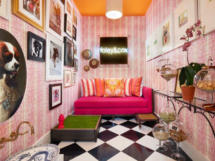
Pet Lounge: Foley & Cox
Designed For: Kips Bay Palm Beach Showhouse
What are some design tips or tricks people can steal from this space?
Play with scale. The oversized black and white diagonal checkerboard floor is balanced by the wall covering’s petite stripe. The gallery wall of our Instagram followers’ pets are a variety of dimensions and are hung floor to ceiling, giving this modest space a grand impact.
Name this space’s big challenge (and how you tackled it).
Being a former, windowless laundry room, we commissioned a neon sign with our company logo and hung it at the end of the space to act as both a light source and a pseudo window.
What’s your favorite design risk that you took in this space?
Having fun with color. The custom wall covering is a fuchsia pinstripe interspersed with orange dots (an homage to the happy colors of Lily Pulitzer). A hot pink chaise anchors the room and a bright orange ceiling draws the eye up and visually raises the height of the space.


Shop Chairish’s Designer Showhouse Sale >>
Lead photo by Michael Lee


